"The adventures of Borp and Theia" Concept Bible
My Year 2 Visual development project, compeleted over a span of 16 weeks.
Overall, I'm really happy how it turned out,
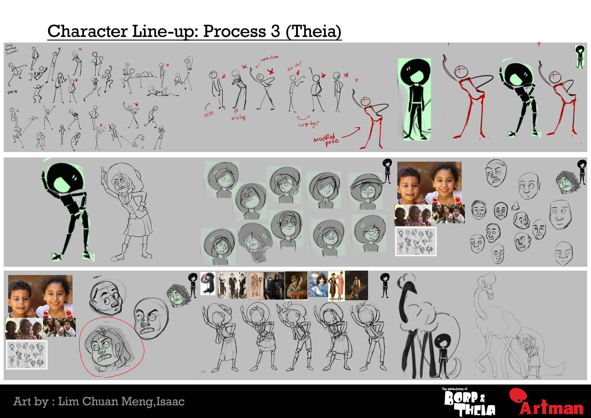
I struggled the most with drawing the hands in 3/4 Ortograpic in the turn around, and my sense of colours really improved, however I feel that Borp's colour isn't the best as his skin tone is too similar to his wool.
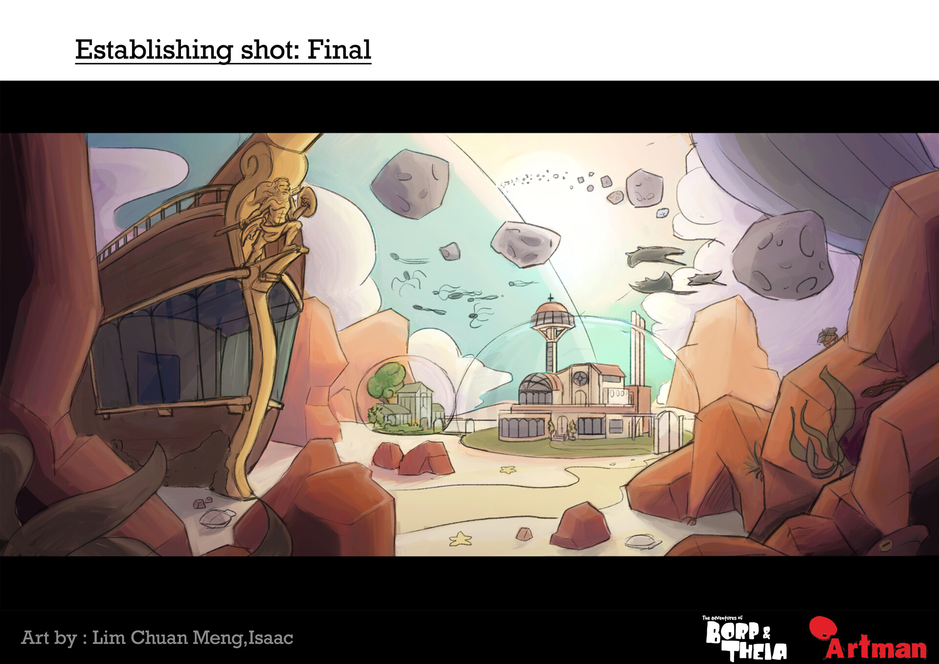
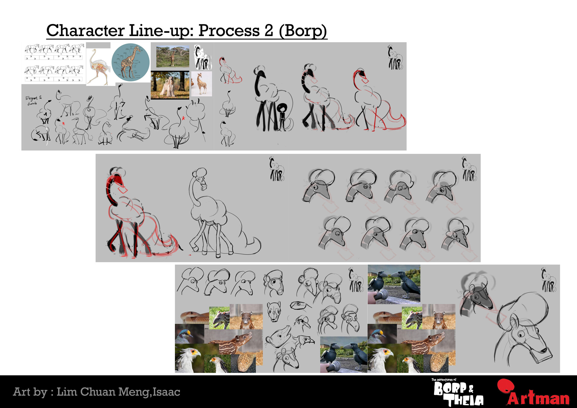
We were assigned a mock studio to work under, to replicate their style of designing characters and environment. In my case, it was Aardman, or "Artman" Animations; the creators of Wallace and Gromit, Pirates! and Shawn the sheep.
Let me know what you think!


2 Page Alternate Spread






left at design stage; never fully realized
